Boxed Letter Font
A boxed letter font uses characters that appear inside squares, rectangles, outlines, or grid-like frames. It can look playful, technical, retro, bold, or highly organized depending on the style. People often search for a boxed letter font when they want text that grabs attention without relying on bright colors or complex graphics. It works well for posters, labels, social media graphics, worksheets, gaming visuals, signs, logos, and personal creative projects. The key is not simply placing a border around every character. A successful design keeps letters readable, balanced, and appropriate for the message. This guide explains what boxed letter fonts are, why they are useful, how to choose and use them, common mistakes to avoid, and practical ways to make your typography look polished.
What Is A Boxed Letter Font?
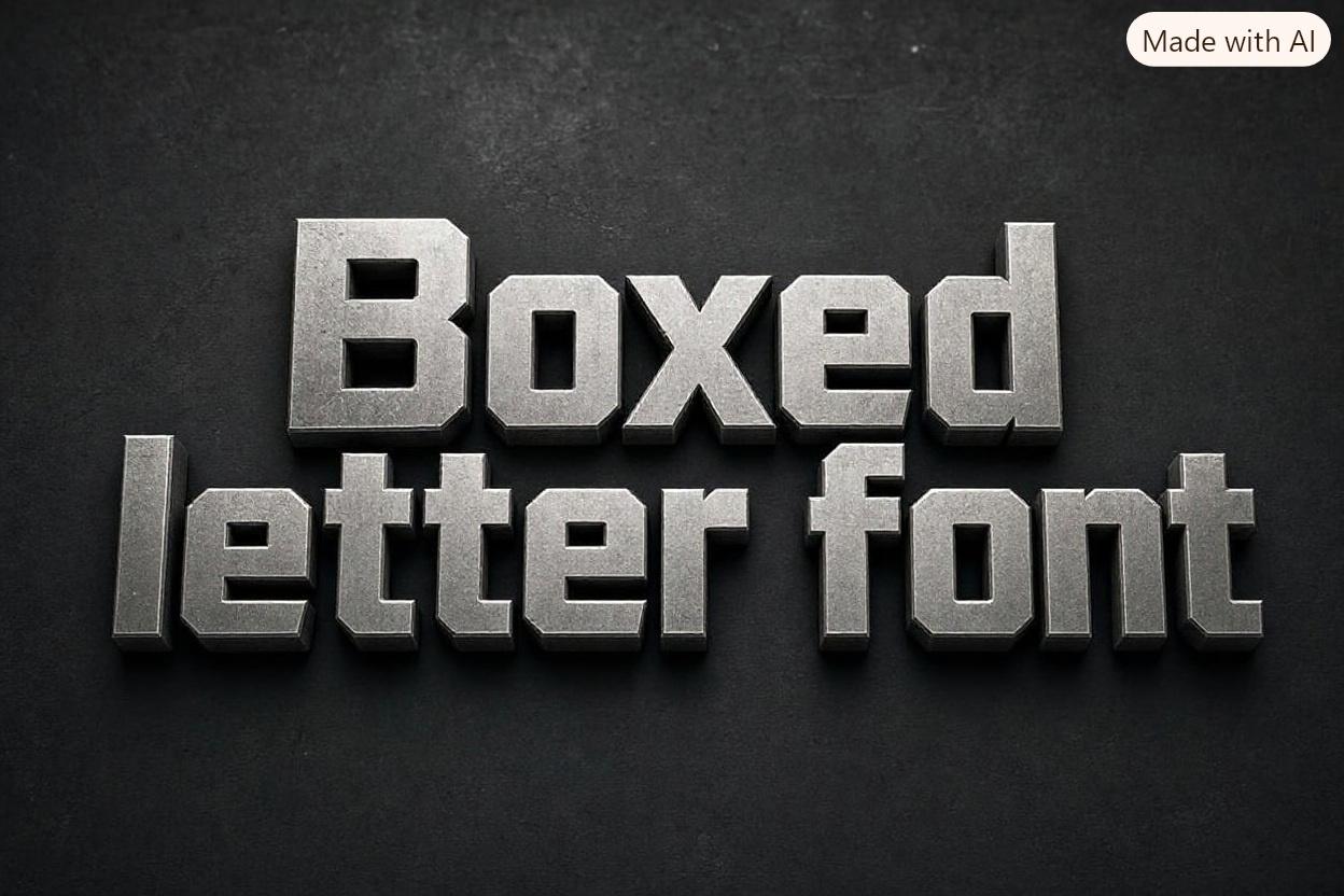
A boxed letter font is a typeface or lettering style where each character is enclosed by a visible border, cell, block, or geometric shape. In some designs, every letter sits inside an individual square. In others, letters are made from boxy strokes, as if they were drawn on graph paper.
The style can range from clean and minimal to decorative and nostalgic. Some boxed fonts resemble arcade screens, shipping labels, scoreboard displays, puzzle grids, or old computer interfaces. Others use soft rounded boxes that feel friendly and modern.
The defining feature is structure. The box gives each letter a clear boundary, which can make the text feel more deliberate and visually organized. This makes boxed lettering especially useful when a message needs to stand out in a busy layout.
Why Boxed Letter Fonts Matter In Design
Typography influences how people feel before they fully read the words. A boxed letter font adds a strong visual rhythm because each character occupies a defined space. That rhythm can make a short headline easier to notice and remember.
This style also supports themes that need order, systems, games, technology, education, or nostalgia. A square-based alphabet can suggest precision and rules, while a hand-drawn boxed style can feel personal and creative. The same basic idea can therefore work for a serious label or a cheerful classroom activity.
Boxed lettering is particularly valuable when the words themselves need to become a graphic element. Instead of treating text as an afterthought, the font can become one of the main visual features of the design.
Types Of Boxed Letter Font Styles
1. Square Grid Fonts
Square grid fonts place letters in even cells, often with straight strokes and sharp corners. They are useful for digital, technical, and retro concepts. Their regular structure creates a neat appearance, although small sizes can reduce readability if the details are too tight.
2. Outline Box Fonts
Outline box fonts use a thin or thick border around each character. The letter may sit inside the border or be formed by it. This style works well for headings because it can look bold without filling every part of the design with heavy color.
3. Block Letter Fonts
Block letter fonts use thick, box-shaped letterforms. They may not include individual frames around every character, but their straight edges and square proportions create the same overall feeling. These are often effective for signs, posters, and sports-inspired graphics.
4. Pixel And Arcade Fonts
Pixel fonts build letters from small square units. They are closely linked with classic video games, digital displays, and technology themes. Use them carefully for longer text because their small details can become difficult to read.
5. Hand-Drawn Boxed Letters
Hand-drawn boxed letters look less exact and more expressive. They are popular in journals, school projects, invitation designs, and creative social posts. Slightly uneven lines can add charm, but spacing still needs attention.
6. Rounded Box Fonts
Rounded versions soften the strictness of square lettering. They are a good choice for children’s brands, casual packaging, friendly apps, and designs that need structure without a hard industrial look.
7. Stencil-Inspired Box Fonts
Stencil-style boxed letters use breaks or cutouts in their shapes. They can feel practical, urban, military, or warehouse-inspired. This type of font can make a strong statement on packaging, labels, event signage, and bold promotional material.
Benefits Of Using A Boxed Letter Font
A boxed letter font offers more than a decorative effect. It can help improve visual hierarchy by making a headline feel separate from surrounding body text. This is helpful in posters, thumbnails, social graphics, and printed materials where viewers scan quickly.
The style can also reinforce a theme. For example, square lettering can support a puzzle event, coding workshop, sports score graphic, game night invitation, or educational worksheet. When the font matches the topic, the overall design feels more cohesive.
Another benefit is consistency. Individual character boxes can create predictable spacing and alignment. This makes short words look tidy, especially when they appear in rows, labels, charts, or menus.
Boxed letters are also flexible. They can be filled with colors, patterns, shadows, or simple outlines. They can look clean in black and white or become lively with bright colors. That flexibility lets designers adjust the same lettering approach for many audiences.
How To Choose The Right Boxed Letter Font
1. Start With The Purpose
Choose the font based on what the design must communicate. A school worksheet may need a simple, open style that children can trace or color. A technology event may benefit from a precise geometric look. The purpose should guide the visual direction before decoration is added.
2. Consider The Audience
A playful rounded boxed font may appeal to children or casual audiences, while a sharp grid font can suit gamers, designers, or technical readers. Think about the reader’s expectations and the emotional tone you want the letters to create.
3. Test Readability First
A font can look impressive in a large preview and still fail in real use. Test the words at the size people will actually see. Check whether similar letters, such as O and Q or I and L, remain easy to distinguish.
4. Match The Font To The Space
Boxed letters need room to breathe. If the layout is narrow or contains many words, a dense block font may feel crowded. Use shorter text, adjust spacing, or choose a lighter style when the available space is limited.
5. Check Character Support
Before committing to a typeface, make sure it includes the characters you need. This matters for numbers, punctuation, accented letters, currency symbols, and special marks. A consistent alphabet looks more professional than a design that switches fonts unexpectedly.
6. Think About Print And Screen Use
Thin outlines may disappear in small printed sizes, while heavy filled boxes can look too dense on a phone screen. Test the font in its intended format. A design made for a large poster may need changes before it works as a social media graphic.
7. Use Contrast Carefully
Contrast helps boxed lettering stand out. A dark box with light letters can be striking, while light outlines on a dark background can feel modern. Avoid combinations that reduce clarity, such as low-contrast colors or busy patterns behind small letters.
Creating Effective Boxed Letter Typography
1. Keep The Message Short
Boxed styles are strongest when used for a title, name, label, or short phrase. A long paragraph in individual boxes can feel tiring to read. Use boxed lettering for the main message and pair it with a simpler font for supporting text.
2. Set Consistent Spacing
Even when every letter has its own frame, the gap between characters still matters. Too little space makes the letters blend together, while too much space breaks the word apart. Review the word as a whole rather than judging each character separately.
3. Align The Boxes Precisely
Alignment is one of the biggest strengths of this typography style. Keep the top, bottom, and side edges consistent unless you intentionally want a handmade look. A clean baseline makes the design look controlled and easier to scan.
4. Use A Clear Visual Hierarchy
If several text elements appear on the page, do not box every single one. Reserve the style for the most important words. This creates contrast and helps readers know where to look first.
5. Choose A Limited Color Palette
A small color palette usually improves boxed lettering. One main color, one supporting color, and a neutral background are often enough. Too many colors can make the boxes feel busy and weaken the impact of the message.
6. Add Decoration With Restraint
Shadows, textures, patterns, and highlights can make boxed letters more interesting. However, every extra effect should support readability. If the decoration makes the word harder to recognize, it is no longer helping the design.
7. Review At Different Sizes
A design should be checked at full size, reduced size, and from a distance. If the text only works when enlarged, it may need simpler shapes, thicker lines, or greater contrast. This review step catches problems before printing or publishing.
Common Boxed Letter Font Mistakes To Avoid
1. Using It For Too Much Text
One of the most common mistakes is applying boxed lettering to a full page of content. The style is visually strong, so it can overwhelm readers when used for body copy. Limit it to key phrases, headings, buttons, labels, or decorative accents.
2. Ignoring Letter Spacing
Boxes can create a false sense that spacing is already solved. In reality, the visual width of letters still varies. A narrow I and wide M may need slightly different spacing to make the word look balanced and natural.
3. Choosing A Style That Is Too Complex
Highly decorative boxes, patterns, or fragmented strokes may look attractive in isolation. They often become confusing when several letters appear together. Prioritize quick recognition, especially for public signs, product labels, or small digital graphics.
4. Forgetting About Background Contrast
A boxed letter font cannot work well if it disappears into the background. Check contrast between the outlines, fills, text, and surrounding area. A simple background often gives these structured letterforms more impact than a detailed image or pattern.
5. Mixing Too Many Font Styles
Combining several display fonts can make a layout look unplanned. If the headline uses a boxed letter font, pair it with a calm, readable supporting font. Let the boxed type carry the personality instead of competing with other decorative styles.
6. Stretching Or Distorting Letters
Changing a font’s width or height can damage its intended proportions. Boxed lettering relies heavily on geometry, so distortion is easy to notice. Choose a font weight or style that fits the space rather than forcing the letters to fit unnaturally.
7. Skipping Real-World Testing
A design may look good in an editing program but perform poorly after printing, resizing, or viewing on a phone. Always test the final use case. Small changes to line thickness, contrast, or spacing can make a major difference.
Best Practices For Boxed Letter Font Designs
1. Pair Display Type With Simple Body Text
Use the boxed font for the feature message, then choose a clean and legible style for explanations. This keeps the design energetic without making every line compete for attention.
2. Build Around A Grid
A grid supports the natural structure of boxed letters. It helps align text, icons, margins, and color blocks. Even when the final design looks playful, a hidden grid can make it feel more polished.
3. Make Accessibility A Priority
Ensure that the letters remain readable for people viewing the design quickly, from far away, or on a small screen. Strong contrast, clear shapes, and adequate size matter more than decorative effects.
4. Use Negative Space Intentionally
Empty space around the letters is part of the design. It gives the boxes room to stand out and prevents the page from feeling cramped. Crowding the edges reduces the clarity that boxed lettering is meant to provide.
5. Let The Theme Guide The Details
A retro game design may use pixels and bright colors, while a premium product label may use thin outlines and muted tones. Use the theme to guide your decisions about corners, line weight, texture, and color.
6. Keep Repeated Elements Consistent
If one word uses square borders, do not switch randomly to circles or uneven frames elsewhere. Repetition creates a visual system. Consistency makes the typography feel intentional rather than improvised.
7. Edit Until The Word Reads Quickly
A viewer should recognize the message without effort. If people pause to work out the letters, simplify the design. Effective typography communicates first and decorates second.
Practical Uses For Boxed Letter Fonts
1. Posters And Event Promotions
Boxed lettering can make event names and dates feel prominent on posters. It works especially well for game nights, workshops, music events, school activities, and themed parties where the headline needs a clear visual identity.
2. Social Media Graphics
Short phrases perform well in boxed styles because they can be read quickly while scrolling. Use the font for a quote, announcement, sale message, challenge title, or content series label, while keeping the rest of the graphic simple.
3. Classroom Materials
Teachers and parents can use boxed letters for alphabet practice, word games, flashcards, bulletin boards, and worksheet titles. Open shapes are especially useful when children need to trace, color, or identify individual letters.
4. Product Labels And Packaging
A boxed letter font can create a strong product name on packaging, especially for snacks, stationery, hobby products, or retro-inspired goods. The design should remain easy to read at shelf distance and at smaller package sizes.
5. Gaming And Streaming Content
Pixel, grid, and arcade-style box fonts naturally suit gaming overlays, channel graphics, scoreboards, and tournament promotions. They can add energy and theme without requiring complex illustrations or large amounts of text.
6. Signs And Wayfinding
Short labels such as entrance, exit, menu categories, locker numbers, or room names can benefit from boxed lettering. The important rule is clarity. Use high contrast and avoid intricate details when people need to read the sign quickly.
7. Personal Creative Projects
Boxed letters are popular in journals, scrapbooks, greeting cards, handmade invitations, and craft projects. A hand-drawn approach gives creators room to add color, patterns, stickers, or seasonal details while keeping the message organized.
8. Brand Campaigns
A temporary campaign can use boxed lettering to create a distinct visual system without changing the entire brand identity. It is useful for limited collections, events, challenges, or seasonal promotions that need a memorable look.
Frequently Asked Questions
1. What Is The Difference Between Boxed Letters And Block Letters?
Boxed letters are usually enclosed in visible frames or cells, while block letters mainly describe thick, bold letterforms with straight edges. The two styles can overlap, but a boxed letter font places more emphasis on borders, grids, or individual character spaces.
2. Are Boxed Letter Fonts Good For Logos?
They can work well for logos when the brand name is short and the style supports the brand personality. A boxed approach can feel memorable and distinctive, but it should remain readable at small sizes and in one-color versions.
3. Can I Use A Boxed Letter Font For Body Text?
It is usually better to avoid using boxed letter fonts for long body text. Their strong structure can slow reading and make a page feel dense. Use them for headings, labels, highlights, and short messages instead.
4. Which Colors Work Best With Boxed Letters?
High-contrast color combinations are generally the most effective. Dark text on a light background or light text on a dark background is a reliable starting point. Use accent colors sparingly so the letters remain the main focus.
5. How Can I Make Hand-Drawn Boxed Letters Look Better?
Begin with light guidelines so the boxes share a consistent height and width. Draw the letter shapes simply, leave even spacing, and use one or two colors. Small imperfections can add personality, but the word should still look balanced.
6. Do Boxed Letter Fonts Work On Mobile Screens?
Yes, but they need careful sizing. Small screens leave less room for fine details, thin outlines, and close spacing. Choose simple forms, strong contrast, and short text so viewers can read the message without zooming or concentrating.
Conclusion
A boxed letter font is a flexible typography choice that can make words look structured, memorable, and visually engaging. It can support many styles, from playful hand-drawn lettering to precise digital grids, as long as readability remains the priority.
Choose the style based on the message, audience, space, and final format. Use boxed letters selectively for key words, give them enough contrast and breathing room, and test the design at its real viewing size. When used with care, this simple lettering approach can turn ordinary text into a strong design feature.
Discussion